FEATURED UX Projects

Thesis: ASU Class Search System
Thesis: ASU Class Search System
Thesis: ASU Class Search System
Phoenix Public Library
Thesis: ASU Class Search System
Thesis: ASU Class Search System
Phoenix Public Library

Project Summary
The main goals of the library’s website are for today’s community to get connected with their passive entertainment catalog (which has various options of books, movies, music, etc.), help them find a library location for them to visit in person, and find events that they might be interested in. The library also aims to allow users to expand their knowledge and connect with the community.
The main issue of the website was that it lacked navigational guidance, making it difficult for users to know where to find primary actions and what specific programs are about or will do. Many of the design changes and recommendations stem from a desire from users for the site to be more clear and transparent with the information so that they can feel confident that clicking on a particular element will take them to the expected page.
Results & Data
Success Rate
Success Rate
Success Rate
Scenario 1: 29 seconds
Scenario 2: 48 seconds
Scenario 3: 1 min 29 sec
Scenario 4: 40 seconds
Average Time
Success Rate
Success Rate
Scenario 1: 93.3%
Scenario 2: 100%
Scenario 3: 66.6%
Scenario 4: 100%
User Quote
Success Rate
User Quote
“Too many things to read, too many buttons, too many colors, too many fonts.”
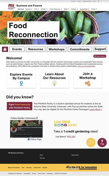
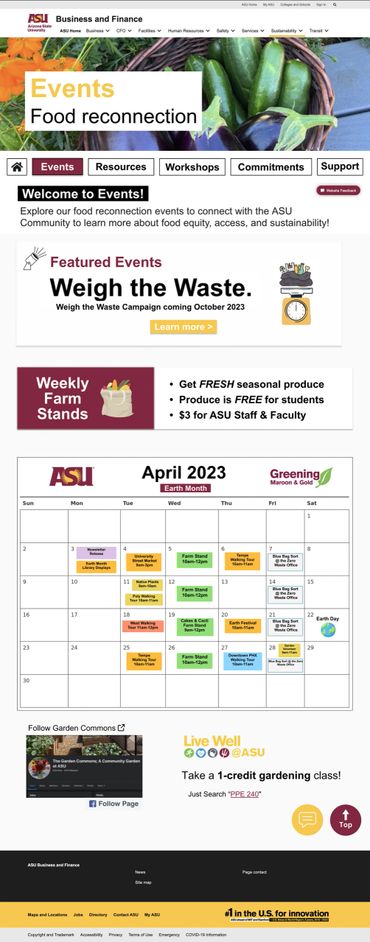
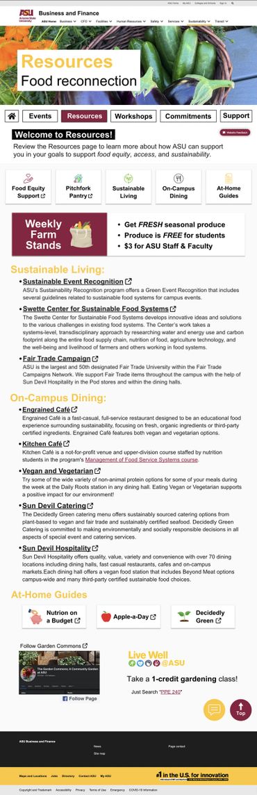
ASU Food Reconnection

Project Proposal
The ASU Food Reconnections page provides a variety of links and resources for the ASU community to connect with, including food equity, accessibility, and sustainability; however, after a preliminary user evaluation, it was found that the Food Reconnections page would benefit from improvements related to content organization, visual web elements, and accessibility tools. Explore below to see the wireframes and mockups addressing the pain points or view my research plan for more information.
ASU Food Reconnection Research PlaN
Project Timeline

All of the website mockups and wireframing were completed individually.
Personas and User Stories


Food Reconnection: Pain Points

Issue #1: Content Overload
A study conducted by the HOPE lab in 2018 found that 36% of college students struggle with food insecurity. ASU’s Sustainability Practices (USP) Food Reconnection program aims to offer resources to food-insecure students; however, its current layout appears text-heavy and preliminary research found that to be a deterrent for most students.

Issue #2: No Engaging Elements
In addition, the lack of more straightforward navigation and the absence of engaging website elements does not support site engagement or navigational guidance. Its layout, rhetoric, and lack of scannable elements prevent students from engaging.

Issue #3: Ad-like Embedments
The current Food Reconnections website also includes poorly embedded resources without a thorough indication of external navigational pathways, which may mislead users and further stray them from their primary goal.
See the recommended solutions below.
Food Reconnection: Solutions

Solution #1: Content Summary
Changes present in my sketch boards for the new Food Reconnection homepage include:
- Modified ASU nav
- Engaging breadcrumb menu
- Summarized content

Solution #2: Engaging Elements
I expanded the Food Reconnections page in my sketch boards in order to:
- organize content into more intuitive categories
- create space for engaging elements (icons, etc.)
- shift focus towards resources available
Solution #3: Embedded Resources
In an attempt to make the site appear more interactive, my sketch boards include:
- an embedded sustainability events calendar
- accessibilty tools and support links
- additional resources to support ASU connections
Figma Redesigns